There are no limits to what you can achieve in Blender. In this next post, you will learn how to design a book cover in 7 guided steps with the author of Blender for Dummies.
Designers, you now have the tools to kick (some more) ass using free software. Show us your first Blender cover in the comments!
Say you’re approached with a request to produce the artwork and design for the cover of a book. The book’s author says, “I want an image of a pair of disembodied pants running around… and on fire.” That same author, for some reason, also requests that you not not pour gasoline on an actual pair of pants (or the person wearing them) and set it ablaze for a photo shoot. Something about the sanctity of human life or somesuch.
What would be the steps you’d take to create that design? Could you do it using just free and open source software?
Short answer: Yes.
Of course, the real question is, “How? What are the steps and the tools you use to go from start to finish?” Hopefully, the rest of this article will prove to be a sufficient answer.
1. Sketching
It all starts with sketches. At this point, it doesn’t matter where you do it or what you use, as long as you get your ideas out. I’m quite partial to an actual, physical sketchbook. It’s quick, portable, and the batteries never run out… just the pages. I do, however, occasionally do my sketching in software. My weapon of choice for this is MyPaint, but you could just as easily use Krita or even GIMP for this step. I just like MyPaint for sketching because it’s got a really powerful brush system and it starts a few seconds faster than any of the other programs. (Hey… it’s not me that’s impatient. Ideas don’t wait for anyone!)
The sketches don’t have to be great, mere thumbnails. The idea here is to get a proper sense of composition for the design. How is the subject in the image arranged in the space? Where does the text go? What does the text look like? Nothing at this point is set in stone, but your sketches should give you a good enough idea of the direction you want to take it.
In my case, I discovered that I wanted the pants to be running from left to right, with fire and smoke trailing behind. The book’s title should be above the paints, partially blocked by the smoke and flames. The sub-title for the book and the author’s name should be placed close to the bottom. Also, not seen in the sketch, but rough ideas for a color palette have started to take hold. Blue jeans are often the first thing people think of when they hear the word “pants.” Fire plays best against a dark background, but smoke doesn’t. And unless they’re really light, the denim in blue jeans may not show well against a dark background. Also, the book is meant to be humorous.
Bearing all of that in mind, the plan at this point was to use a light background that plays nice with the smoke and pants. Then massage the colors in the flames so that they don’t suck.
2. 3D modeling and simulation
The centerpiece of this cover design is the image of the running pants on fire. So it’s critical to get this image to look good. The key here is to work with sufficient detail in the 3D model so it stands up well in print. At this point, it’s best to know the actual cut size of the completed book. I didn’t. That ended up giving me extra work down the road when I needed more detail in the pants. More on that in a bit. First, the starting point.
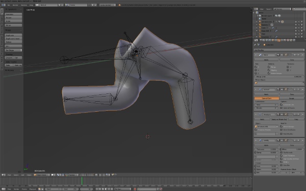
Modeling screenshot – Pants pre-sculpt
All of the 3D elements of the image (pants, fire, background) were modeled, simulated, and rendered in Blender. The pants were roughed into place using basic box modeling techniques. Then a simple armature was created to deform the pants into the proper pose. Using that as a starting point (and saving that object to another layer in case I wanted to come back to it), I applied all modifiers and set to adding detail with Blender’s sculpt features. Dyntopo (Blender’s sculpting feature with dynamically generated geometry) was a huge help here, especially since I knew that the pants (at this point at least) would not be animated. So I didn’t have to worry about keeping clean, nicely deformable topology when sculpting. I just needed to get that detail.
Simulating the fire was, of course, a time-consuming series of trial-and-error experiments and adjustments. Eventually, using a combination of smoke/fire sources, wind, and smoke collision, I was able to tune the simulation to taste.
I recorded a timelapse of this whole process (feel free to mute the audio; it’s just me trying to keep up with a description of the steps in the process).
3. Rendering er… Dimensions and adding detail
I said in the last step that I didn’t know the final dimensions of the book and it would cause me time and grief in the future. Well, rendering is where that grief happened. At this point, I finally knew that the finished dimensions of the book would be 5″x8″. However, I did not yet know how many pages would be in the book, so I had no way of calculating the dimensions of its spine. Fortunately, knowing 5″x8″ was enough. I knew that the smoke would wrap around the cover to the back. I could just adjust the left edge of the final render to get the size and dimensions I wanted. Therefore, I started with just the front cover image.
Most commercial printers use a bleed area of 1/8″. That means that the dimensions I really wanted to work in was 5.25″x8.25″ (1/8 on each side equals 1/4 overall). And remember, I’d be extending the left edge of the image once I knew the dimensions of the spine. Now that I knew the physical dimensions, it was a simple matter to calculate the finished render size. 300ppi strikes a comfortable balance between reasonable render times and an image that looks really good in print. So multiplying 300 by the physical dimensions, I got a render size of 1575×2475 in pixels. This is where I realized I had an issue. Rendered at that size, the fire simulation I’d already baked was overly blocky and my pants looked way too cartoony. Much more detail was required.
Upping the detail on the smoke and fire was relatively simple, albeit time-consuming. I just needed to rebake the fire simulation at a higher resolution and find a single frame of the simulation that looked really good.
The pants, however, needed more personal attention.
So after another round of sculpting (no timelapse on this one, sorry) to add belt loops, stitching seams, pockets, and more defined folds, the pants finally started looking right. The color, however, was too flat. Since I used Blender’s Dyntopo features for sculpting, the surface topology for the pants was all over the place, leaving only two really viable options.
- “Standard” practice would be to retopologize the pants and then UV unwrap them for texture painting. Even though this approach is the most correct, retopologizing can be a time-consuming process and I was on a deadline. Fortunately, there was another option.
- Being sculpted, the pants weighed in at just under 90k faces. That’s plenty of geometry to get sufficient detail using vertex colors. In fact, vertex colors are super flexible. With two layers of vertex colors mixed with a couple other attributes (namely a noise texture and color adjustments using geometry “pointiness”), I was able create a material for the pants that passed reasonably well for jeans.
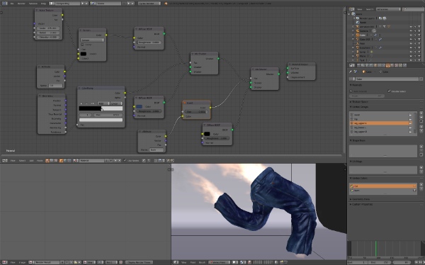
Blue jeans material for Cycles using vertex colors and nodes
(Side-note: it wasn’t long after this that I got the final page count for the book and was able to calculate the thickness of the spine. The finished render needed an image size of 3364×2476 pixels.)
4. Now we render!
I have a pretty powerful computer. Even though it’s pushing 3 years old, it’s still got a hex-core processor, 16 GB of RAM, and a sufficiently modern GTX 560 video card. That GPU is starting to show its age, but the machine itself is no slouch… and in the case of this image, a more powerful video card wouldn’t do me much good anyway.
See, although the Cycles renderer can be accelerated with a GPU, the ability to render smoke and fire on the video card is not supported. That means that without some clever render layer management, the whole image needs to be rendered on the CPU (read: much, much slower). Furthermore, because I knew I still needed to composite in title graphics, I already had two render layers defined. One was for the fully composed image and one was without the cyc (short for cyclorama, the floor that gently curves up to the wall so there are no visible corners). The second render layer ensures I have a suitable mask of the pants and fire. Because there are two layers that have mostly the same content, it technically meant that the image needed to be rendered twice.
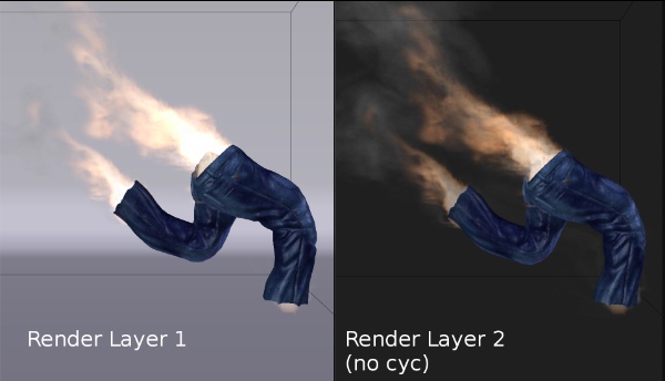
The completed render and mask from RenderStreet
By test-rendering a couple tiles from my scene, and checking the feedback from Cycles, I was able to estimate that on my computer’s CPU it would take between 17 and 24 hours to render just one render layer of this image. That means it would take just under two full days to kick out both of the render layers I need. Two days. All of them. And I wouldn’t really be able to use my computer for much of anything else during that time period since all of the processing cores would be dedicated to creating this image (or risk taking even longer to complete)… and I still needed time after that to do touch-ups and lay in the type. Not acceptable. Like I said, I was on a deadline.
This is where RenderStreet really saved my tail. When you need to get an image rendered as quickly as possible, nothing beats throwing that job at the computing power of a good render farm. And RenderStreet’s farm is indeed really good.
Of course, that doesn’t mean there weren’t complications. The biggest issue I had was getting my baked fire simulation to actually render. Technically speaking, I should have been able to upload just the one frame of the baked smoke simulation cache along with the .blend file and everything would be just peachy. Sadly, because of the smoke simulator’s proclivity for wanting to re-simulate when it doesn’t feel there’s sufficient data in the cache, uploading just one frame wasn’t enough at all. At the very least (and to be sure it would work), I needed to upload every frame in the cache up to my chosen frame (in this case, frame 90). That meant pushing right around 3.5 GB of simulation data to RenderStreet’s FTP server.
As time-consuming as that upload process was (an hour or so), it was still far less time than what it would take for me to render. Once the smoke simulation cache was uploaded, it took RenderStreet’s farm just over one hour to produce a beautiful multilayer OpenEXR file. So including the upload time for the cache, RenderStreet took 2 hours to generate an image that would taken my computer 2 days.
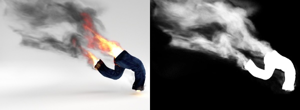
The completed render and mask from RenderStreet
5. Touch-ups and paint-overs
The cover image isn’t done yet! One of the things that bothered me about the smoke simulation from Blender was there wasn’t enough smoke in a few places. Around the waist and the cuffs of the pants, it just looked a bit too clean. More smoke was needed there. Rather than try to spend countless hours fighting with the simulator to place that smoke just how I wanted, it was far faster to just paint in that desired additional smoke.
My preferred tool for this kind of work is Krita. It supports high bit-depth multilayer OpenEXR files and its painting and brush system are simply sublime. Unfortunately, in this case, Krita wasn’t playing nice with me for some reason. I suspect my color management settings weren’t configured properly. When I loaded the OpenEXR in Krita, all of the colors were off… and felt quite dark and oversaturated.
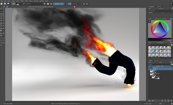
Krita screenshot
Rather than dig in and figure out exactly what it was I was doing wrong, I jumped over to Plan B… Blender! Blender’s painting system isn’t nearly as well-refined as Krita’s or MyPaint’s, but in this case, I was just laying some additional smoke on the image. That doesn’t require an overly complex set of brushes, just some simple textures and a delicate touch. (Why are you laughing? I can be delicate!)
Anyhow, with the little paint-over complete, the next step was laying in the type.
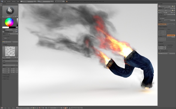
Blender painting screenshot
6. Titles and typography
Generally speaking, when adding type to a design, the best practice is to do so in a vector format rather than a raster one. The type is more crisp and adjustments are easier to make. And for most of the text on this cover design, that’s exactly what I did. I fired up Scribus and dropped in the text for the subtitle, byline, spine text, and back-cover copy. Those elements were all placed over the image that rendered and painted in Blender (note: Scribus doesn’t support OpenEXR, so the painted image needed to be saved as a 16-bit PNG).
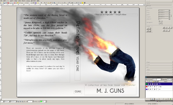
Scribus screenshot
For the title text, however, I wanted to do something a little special. Remember how I said I had two render layers? This is why. I wanted the title text to subtly interact with the smoke and fire, to be partially obstructed from view by it. That’s not something easily achieved with vectors. That needs to be done in raster land. Of course, vector tools are still the most appropriate ones for working with type and I’d already designed the title text using Inkscape (for anyone interested, the font used for the title of this book is Caviar Dreams, from Nymphont).
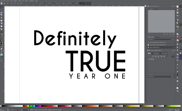
Inkscape screenshot
Now, can you take a guess at the program I used to marry the title text with the rendered image? That’s right, Blender! I started a new Blender session and set it to use the same render size settings as the smoke simulation rendered on RenderStreet. Then I imported the SVG curves from the title I designed in Inkscape. I also set my paint-over image (the same one used in Scribus) as my camera background so I could properly place the title text. Then, using a little compositing magic (and that mask render layer), I was able to get the title to play nice with the smoke.
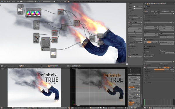
Blender screenshot
7. Finishing
With the title-integrated cover graphic rendered to a 16-bit PNG, I could re-open Scribus and update that image. From there, I massaged the rest of the type and added a few finishing touches, like a logo for my imprint (The Giant Coffee Blunderbuss) and a barcode for the book’s ISBN. The barcode was actually generated from a handy plugin built right into Scribus. Quick and easy!
Once that was done, all that remained was kicking out a print-ready PDF of the cover (and then lay out the interior of the book… but that’s a story for another time).
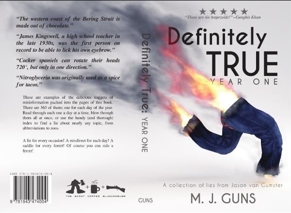
Finished book cover
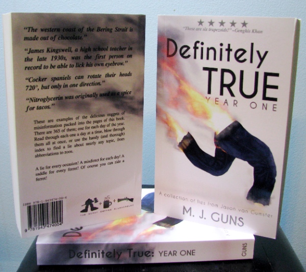
Definitely True: Year One—the book
So yes… it’s possible to design a book cover — from concept to print — using just free and open source software. That’s Definitely True.

Jason van Gumster aka @monsterjavaguns on Twitter
Jason van Gumster is the author of Blender for Dummies and GIMP Bible, a Blender Foundation Certified Trainer and BlenderArtists moderator (his username is ‘Fweeb’).
He also writes under the name M. J. Guns. Definitely True: Year One is his first indie book, a project funded on Kickstarter.


